Dated website that lacked the modern features members needed to have a positive experience and an underserving CMS
Solution
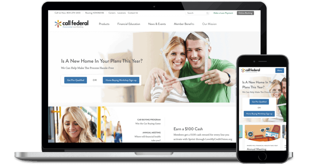
New strategy with redesigned user experience (UX), information architecture (IA), and administrative experience (AX).
Background
Call Federal Credit Union (CFCU) is a local credit union focused on serving the Richmond, Virginia region. Founded in 1962 as an exclusive banking option for Philip Morris employees, Call Federal opened their doors as a community chartered credit union in 2010.
Following their expansion, Call Federal appropriately followed up with a mass campaign to reintroduce themselves to the community in 2015. With an updated logo and a new brand tagline, “Passionately Local Banking”, the company set out to establish themselves as a competitive alternative to regional and national banks but with the appeal and approachability of a community credit union. To further set themselves apart from the competition, Call Federal has made an effort to become the community go-to for financial resources and advice. The company continues to build this reputation by providing online financing tools, articles, and in-person workshops, to help improve the overall financial health of the Richmond community.
Upon Redesign
Call Federal has grown to be a $370 million financial institution that has faithfully served 30,000 members in the 16 counties and cities of Richmond, Colonial Heights, Hopewell, and Petersburg.
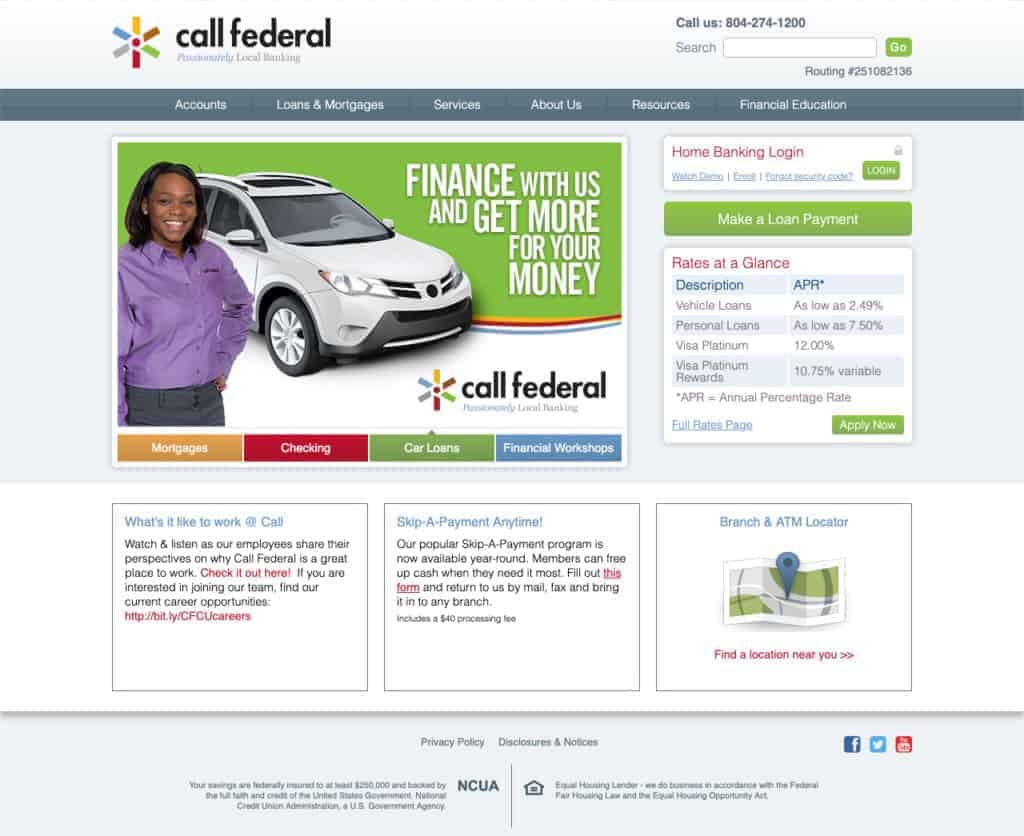
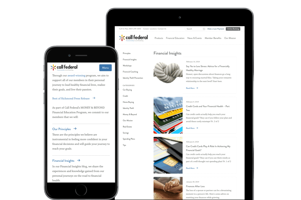
The Call Federal Credit Union website before our redesign.
The Opportunity
Although they have been part of the Richmond community for over 50 years, Call Federal is still unfamiliar to those who are not part of the Philip Morris company. To reacquaint themselves to the community, Call Federal recognized they needed their best face forward, starting with a website redesign. COLAB was hired to transform the site into an effective digital representation of who Call Federal really is.
Dated Web Experience
As a bank that strives to provide friendly and easy experience, the site was lagging behind compared to their quality offline, in-person customer service. With confusing navigation and pages with repetitive and outdated content, user experience was hindered. The biggest challenge was reorganizing Call Federal’s content-dense site and refining it down to create a more intuitive site structure that was conducive to increasing accessibility and conversion.
Content Strategy
The older CMS accumulated a lot of content noise. The internal team, found it impossible to schedule posts let alone publish new items and maintain evergreen content. They quickly wanted to to start from a scratch and create an admin experience that would bring their employees more confidence and control over Call Federal’s content.
Education/Resources
Lastly, Call Federal wanted to go beyond the expectations of a common community credit union by introducing educational content in a modern and well-designed package. With their new focus on improving financial literacy to Richmond, creating a space to house their financial advice would be essential to establishing their expertise.
The Solution
Site Architecture and Content Strategy
After identifying confusing user flows, we reorganized Call Federal’s site structure to be more succinct and user-friendly. Because of the many product subcategories being offered, we consolidated all products into a less overwhelming, overarching navigation item appropriately titled “Products”. On hover, “Products” displays a mega menu of the reorganized product section, allowing consistent access to all services regardless of where the user may be in the site.
Paired with a simplified and consistent navigation, we strategically created areas dedicated to call-to-actions meant for cross-linking pages. This was to reassure that we provided appropriate opportunities for users to explore and click further into Call Federal’s content.
Design
To further ensure optimal user interaction, we created a light, minimal, and friendly design. Utilizing white space and the brand colors as accents throughout the design, we were able to do this while also modernizing Call Federal’s aesthetics without losing approachability.
Accessibility
The redesign also heavily focused on promoting an online experience that followed the Web Content Accessibility Guidelines (WCAG 2.0) referenced by Section 508 ,Title III of the Americans with Disabilities Act (ADA). From color and size contrast to keyboard accessible navigation, the site was thoroughly checked against WCAG 2.0 Level AA requirements.
Site Features
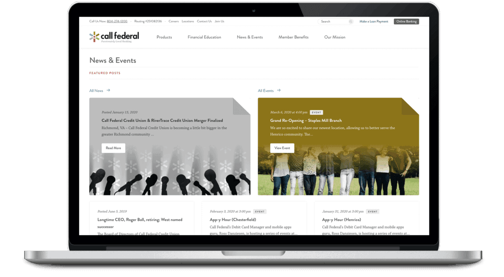
Key site features such as the featured news and event posts were one of the most fun yet accessibility-challenging design elements of the site. These post-it style cards’ content and imagery are fully customizable by our client while the overlaying gradient is autogenerated by javascript. We created a feature that samples a range of colors from our client’s uploaded photo, orders the colors from brightest to darkest, then checks each color against the font color of the featured card. Once selected, the color combination that looks the best while still meeting WCAG 2.0 Level AA standards is used. This allows Call Federal to focus on their photo choices without having to worry about the readability and accessibility of the overlaid text.
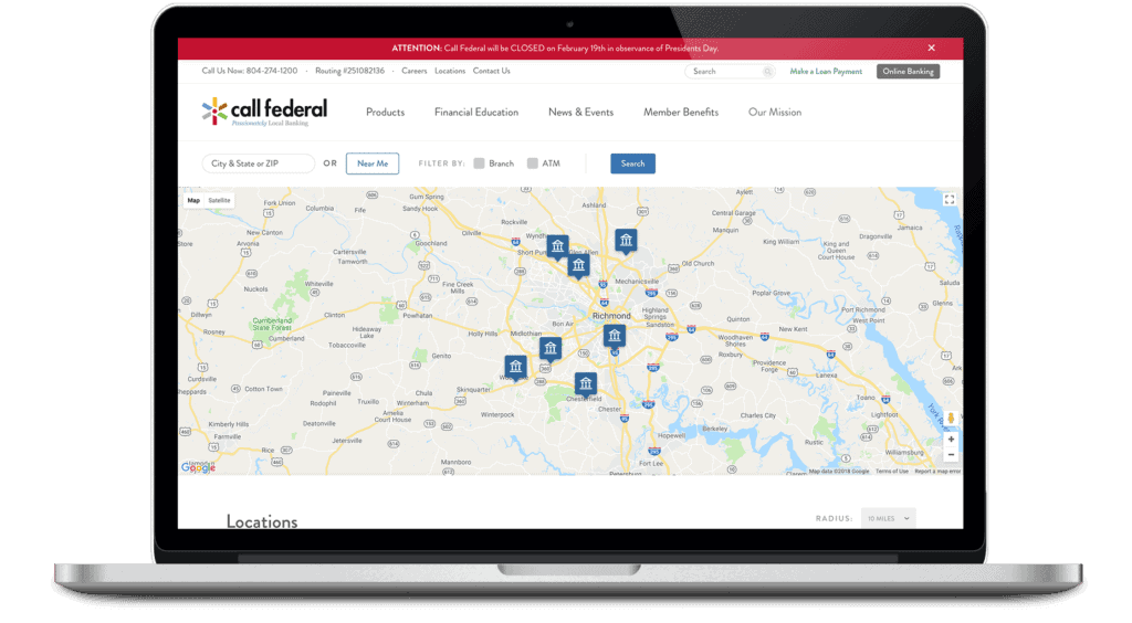
Creating a more user friendly and pleasant experience on the site also meant finessing how Call Federal communicated with their members, especially when it came to locations, alerts, and bank terminology. We revamped the locations page by developing a more robust map that allows users to find branches and Call Federal-friendly ATMs relative to their GPS location. We created a customizable alert feature that displayed at the top of the homepage that is easily toggled on and off in the CMS. We encouraged a shift from downloadable PDFs to accessible, responsive tables.
Content Management
Lastly, we developed a responsive WordPress site with a fully customized CMS. Considering their time-sensitive publishing needs, we provided tools for the internal team to create and post content the way they wanted, when they wanted. Upon request, we also implemented analytic tracking features so that Call Federal can be knowledgeable of the activity on their site and make more informed business decisions because of it.
Our senior colleague was telling us sites rarely launch when they are supposed to without error. This was the best launch we’ve ever had – it went so smoothly and we’ve received a ton of compliments. Your team did an excellent job.
Cara Clements Director of Marketing, Call Federal Credit Union
The Outcome
Launched in 2018, the website for Call Federal Credit Union continues to function for the organization.
The team was equipped with new tools that allowed marketing to focus on marketing rather than navigating a difficult to use tool. Members now had more at their disposal to make smart financial decisions. And finally, the credit union avoided risk by having an accessible website.
We appreciate the team’s partnership in collaborating on a successful redesign.