
Every year, we trade playlists in December. Someone’s deep into obscure indie. Someone else (it’s me) has Disney next to synthwave and metal, thanks to kids hijacking the smart speakers.
That simple recap vibe is why these year-in-review roundups land: proprietary data turned into a story people want to share. It’s not just Spotify anymore. Plenty of teams package their annual data into something scannable and socially sharable.
Below are some of our favorites and the elements we think you should borrow. Interested in building your own? Jump to the end for a way to start.

Spotify Wrapped
Why people care
Wrapped is an annual ritual. People expect it, compare with friends, and post it as a small act of identity, “this is who I was this year.” The format rewards curiosity (surprises in your top artists), reflection (how your habits changed), and status (taste signaling on social). It’s quick, visual, and built to be shared in seconds, which is why it dominates feeds for a week every December.
What to borrow
- Reflect the user to themselves.
- Keep it fast, cards or slides, not walls of text.
- Design for sharing from the start.
Corporate Message: Spotify 2024 Wrapped
Personalized Message (updates annually): 2025 Wrapped on Spotify
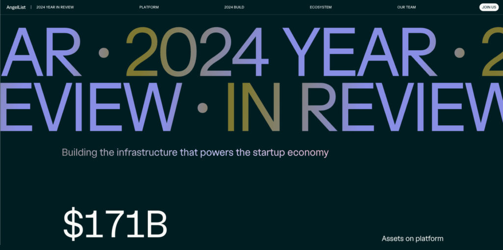
AngelList 2024
Why people care
AngelList’s annual page distills a year of startup activity into a clear snapshot: where capital flowed, what roles companies hired for, which sectors heated up, and how founder and investor behavior shifted. Because the report builds on real marketplace signals (jobs, talent, and funding), readers treat it like a benchmark. Founders and operators use it to double-check plans; investors use it to spot momentum and compare cycles. It’s a fast way to understand the year without living in spreadsheets.
What to borrow
- Lead with market‑level insights drawn from your own aggregated data.
- Give a skimmable executive summary (5–7 bullets) before deep charts.
- Provide downloadable graphics and a short highlights section for PR and decks.
- Link to methods so the numbers feel sturdy and repeatable.
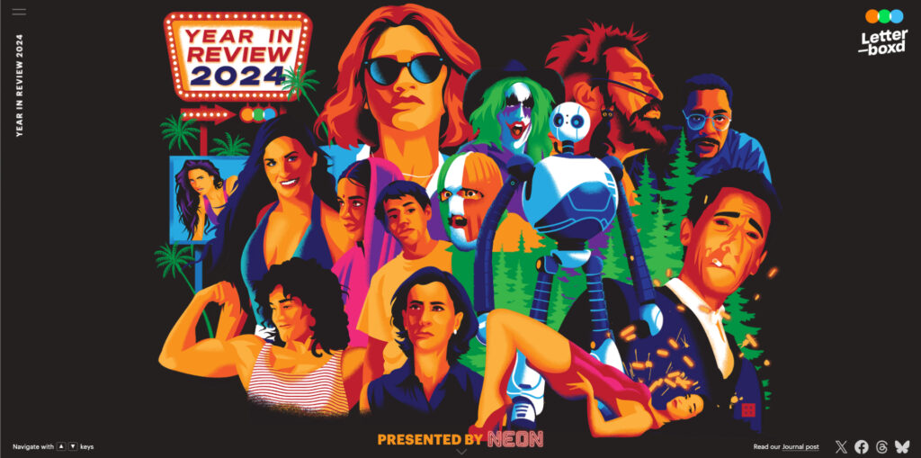
Letterboxd Year in Review
Why people care
Letterboxd turns the year in film into an editorial event. The 2024 recap maps what mattered, most‑logged movies, breakout performers, highest‑rated releases, festival darlings, and hidden gems, using platform data plus curation. It gives fans a common reference point for movie talk, fuels watchlists for the holidays, and captures the mood of the year without requiring heavy personalization. Signed‑in members can still view their own stats, but the headline experience is a culture snapshot anyone can browse.
What to borrow
- Treat your category like a culture map: what defined the year beyond your product?
- Blend data with editorial judgment so the story feels authoritative, not auto‑generated.
- Make it timeless and browsable (lists, spotlights, archives), with clear CTAs to keep exploring.
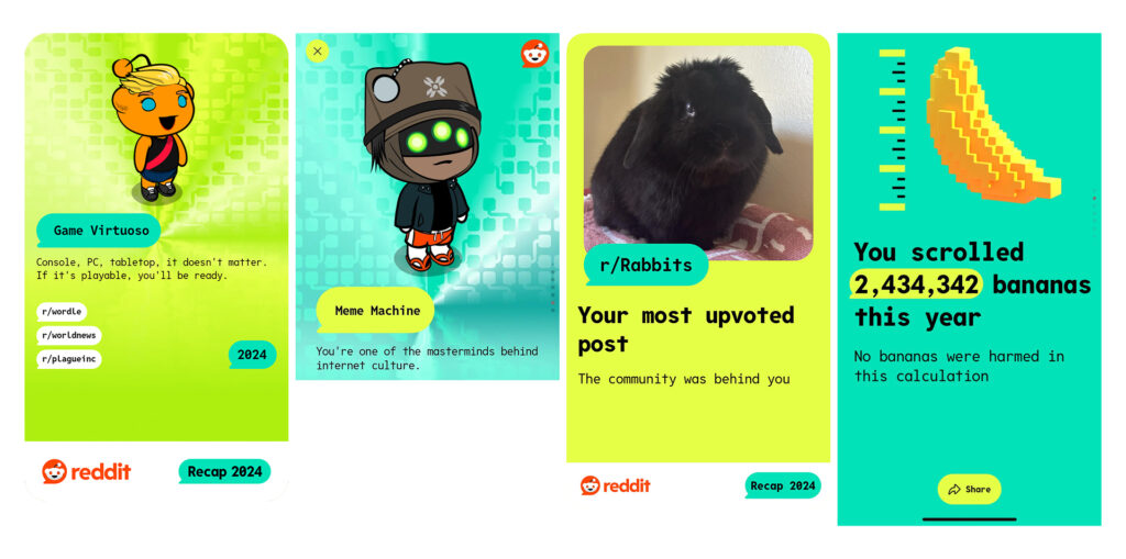
Reddit Recap
Why people care
It connects your personal browsing to the wider culture of Reddit. You see the communities and moments that shaped the year, plus the context you likely missed. That blend of “me” and “we” creates belonging, validates time spent, and sparks new follows and conversations. It’s as much a tour of internet culture as it is a recap.
What to borrow
- Pair “you” data with “community” data.
- Use comparisons to show scale.
- Highlight moments, not just metrics.
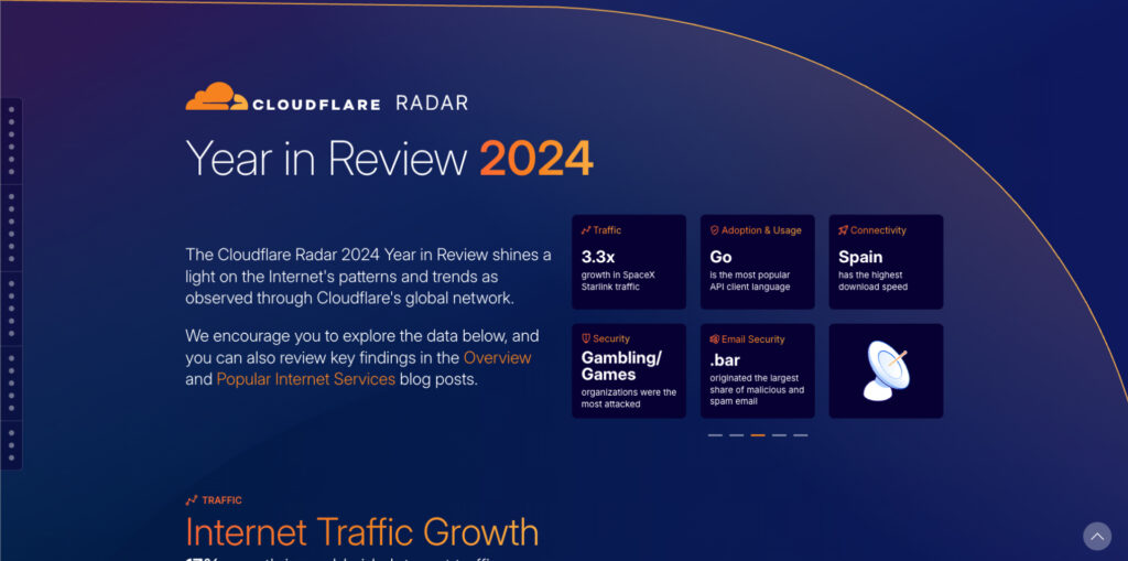
Cloudflare Radar Year in Review (2024)
Why people care
Cloudflare’s recap uses data from organizational‑scale telemetry and purpose‑built data visualization. It synthesizes traffic spikes, outages, attack patterns, protocol adoption, country‑level connectivity, and service usage into clean charts that a CTO, comms lead, or reporter can drop straight into a brief. Because the data comes from Cloudflare’s global network, it reads as a neutral, credible view of the internet, useful for benchmarking reliability, understanding security risk, and explaining the year’s events to non‑engineers.
What to borrow
- Build from your first‑party data and show the method so the visuals are defensible.
- Design charts for reuse: clear titles, labeled axes, consistent units, downloadable images.
- Organize by themes, like reliability, performance, and security, so different stakeholders can skim what matters.
- Add concise “what it means” annotations next to the visual to bridge data → decision.
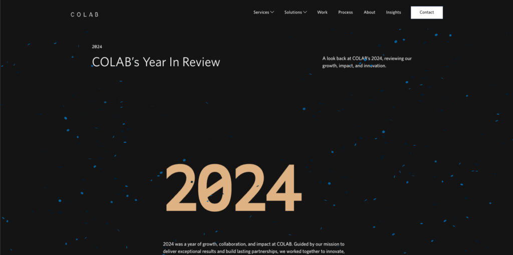
COLAB Year in Review (2024)
We closed our own year with a public recap. A few highlights:
- Work, at a glance: 65 clients served, 164 deployments, 48 design projects, 6,397 code commits, and 447 bugs squashed.
- New partnerships & major projects: From Appily and Hilldrup to Virginia Credit Union and Sports Backers, we shipped work for long-time and new clients alike.
- Team & community: 23 teammates, milestone anniversaries (including Ralph at 15 years), DEIB training hours, and local support through donated time and a school supply drive.
Want the full picture? Read COLAB’s Year in Review (2024).
Build Your Own (without a long build)
- Pick one narrative. Growth, community impact, product adoption, or customer wins.
- Choose 5–7 metrics that serve that narrative. If a number doesn’t move the story forward, drop it.
- Show change. This year vs. last, you vs. the community, you vs. your goal.
- Design for speed. Mobile-first cards, bite-sized text, tap-through flow.
- Make it share-ready. Exportable images, prewritten captions, and social-safe contrast.
- Personalize where you can. Even small touches (name, segment, region) help.
- Ship a v1. Start with a lightweight microsite or card set; add interactivity next year.
Starter metric ideas
- Top 3 moments or launches
- Most engaged content or feature
- Growth (users, customers, revenue, donations)
- Community highlights (events, volunteers, creators)
- Footprint (cities, countries)
- “You vs. last year” for each user/customer
Don’t Forget to Celebrate the Wins
A tight year-in-review can celebrate wins, thank your audience, and set the tone for January. Want help turning raw data into a clean, interactive microsite? COLAB can handle the design and build while your team curates the story.